.jpg)


Quick Analysis Tool Excel: Where To Find & How To Use
Do you have to perform complex excel calculations on a daily basis? If yes, then you cannot ignore the importance of the quick analysis tool Excel to complete your task on time. Now, you need to upgrade yourself with the changing needs of the industry.
In this article, you will learn about different functionalities of quick analysis tool Excel to meet your requirements. Now, for handling complex calculations you must follow some steps that can make things easier for you.
You must go through these details of this tool to make things happen in your favour. Here, application of the correct technique can make things happen in your way.
Table of Contents
- What Is A Quick Analysis Tool In Excel?
- Where Is Quick Analysis Tool In Excel?
- How To Enable or Disable Quick Analysis Tool In Excel?
- How To Use Quick Analysis Tool?
- Quick Analysis Examples
- Calculating Percentage Total For Rows And Columns
- Highlighting Cells Greater Than Specified Value
- Creating Pie Chart Using Quick Analysis Tool In Excel
- Inserting Sparklines
- Quick Analysis Tool Excel Shortcut
- How To Access Quick Analysis Tools In Excel?
- Quick Analysis Tool Pivot Table
- Final Takeaway
What Is A Quick Analysis Tool In Excel?
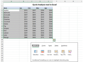
The Quick Analysis Tool in Excel is a feature that provides a fast and easy way to analyze data with a set of one-click options for common tasks. When you select a range of data, a small Quick Analysis button (a small icon with a lightning bolt) appears at the bottom-right corner of the selection. Clicking it opens a contextual menu with tools to:
- Format: Apply conditional formatting (e.g., data bars, color scales, icon sets) to highlight trends or patterns.
- Charts: Create charts like bar, line, or pie charts based on the selected data.
- Totals: Add calculations like sum, average, count, or percentage totals.
- Tables: Convert the data range into a table or add pivot tables for summarizing data.
- Sparklines: Insert mini-charts within cells to show trends.
It’s designed to save time by offering quick access to these features without navigating Excel’s full menu system. The tool is available in Excel 2013 and later versions.
Where Is Quick Analysis Tool In Excel?
The Quick Analysis Tool in Excel appears as a small icon with a lightning bolt at the bottom-right corner of a selected data range. To locate and use it:
- Select your data: Highlight a range of cells containing data (e.g., a table or list).
- Look for the icon: The Quick Analysis button will appear just outside the bottom-right corner of your selection. If you don’t see it, ensure you’ve selected at least two cells with data.
- Click the icon: This opens a contextual menu with tabs like Formatting, Charts, Totals, Tables, and Sparklines for quick analysis options.
The tool is available in Excel 2013 and later versions (including Excel 2016, 2019, 2021, and Microsoft 365) on Windows and Mac. If you can’t find it, check that your Excel version supports the feature or that the selection contains valid data (not just text or blank cells).

How To Enable or Disable Quick Analysis Tool In Excel?
There are some simple steps to enable or disable the quick analysis tool Excel. So let’s explore the process to enable or disable the quick analysis tool in Excel in a step by step process.
How To Enable Quick Analysis Tool?
- Open Excel: Launch Microsoft Excel on your computer.
- Select Data: Highlight the range of cells you want to analyze.
- Check for Quick Analysis Button:
- After selecting cells, a small Quick Analysis button (a lightning bolt or a small icon) should appear at the bottom-right corner of the selected range.
- If it appears, the tool is already enabled, and you can click the button to access options like formatting, charts, totals, tables, or sparklines.
- Ensure the Feature is Active:
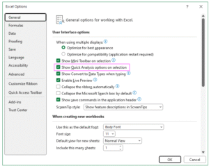
- Go to File > Options (or Excel Options on older versions).
- Within the Excel Options dialog box, select General (or check other tabs like Advanced in some versions).
- Look for an option like Show Quick Analysis options on selection. Ensure this box is checked.
- If it’s not visible, the feature might already be enabled by default, as it is in most modern Excel versions (2013 and later).
How To Disable Quick Analysis Tool?
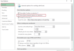
Open Excel Options:
- Go to File > Options.
Navigate to General Settings:
- In the Excel Options within dialog box, select the General tab.
Disable Quick Analysis:
- Find the option labeled Show Quick Analysis options on selection (usually under the “User Interface options” section).
- Uncheck this box to disable the Quick Analysis Tool.
Save Changes:
- Click OK to apply the changes. The Quick Analysis button will no longer appear when you select a range of cells.
How To Use Quick Analysis Tool?
There are some simple steps that you need to take to analyze the quick analysis tool. Some of the key steps that you must consider here are as follows:-
1. Select Data:
- Highlight the range of cells you want to analyze. This could be a table, a range of numbers, or any dataset.
2. Access The Quick Analysis Tool:
- After selecting the cells, a small Quick Analysis button (a lightning bolt or small icon) appears at the bottom-right corner of the selected range. Click this button.
- Alternatively, press Ctrl + Q (in Excel 2016 and later) to open the Quick Analysis menu.
3. Explore The Quick Analysis Options:
The Quick Analysis Tool provides a menu with several tabs, each offering different analysis options. These include:
- Formatting:
- Apply Conditional Formatting like Data Bars, Color Scales, Icon Sets, or highlight cells (e.g., greater than a specific value) to visualize data patterns.
- Example: Select “Data Bars” to add visual bars proportional to cell values.
- Charts:
- Create quick charts like Column, Line, Pie, or Scatter based on your data.
- Hover over chart options to preview them, then click to insert the chart into your worksheet.
- Example: Select a range of sales data and choose a “Clustered Column” chart to visualize trends.
- Totals:
- Add calculations like Sum, Average, Count, % Total, or Running Total to summarize your data.
- Example: Select a column of numbers and choose “Sum” to add a total row below the selected range.
- Tables:
- Convert your data into an Excel Table or create a PivotTable for advanced analysis.
- Example: Choose “Table” to format your data as a table with filtering and sorting options.
- Sparklines:
- Insert mini-charts (Line, Column, or Win/Loss) within cells to show trends.
- Example: Select a row of data and choose “Line” to add a sparkline showing the trend in an adjacent cell.
4. Apply An Option:
- Hover over any option to preview how it will look on your data.
- Click the desired option to apply it to your worksheet.
5. Customize As Needed:
After applying an option (e.g., a chart or conditional formatting), you can further customize it using Excel’s standard tools (e.g., Chart Design or Format options).
Quick Analysis Examples
There are some quick analysis examples that you must be well aware of when you handle the quick analysis tool from your end. Some of the key factors you need to be well aware off are as follows:-
Changing Range To Excel Table
Method -1 Quick Analysis Tool
- Select the Data Range:
- Highlight the range of cells you want to convert into a table. For example, if you have data in cells A1:B7 (like the monthly sales data from your previous question), select that range.
- Open the Quick Analysis Tool:
- After selecting the range, the Quick Analysis button (a lightning bolt icon) appears at the bottom-right corner of the selection. Click it, or press Ctrl + Q.
- Choose the Table Option:
- In the Quick Analysis menu, go to the Tables tab.
- Click Table. Excel will automatically convert the selected range into a formatted table.
- Confirm and Customize:
- The range is now an Excel Table with filter arrows in the header row (e.g., “Month” and “Sales”).
- You can customize the table by:
- Using the Table Design tab (appears when the table is selected) to change the table style, add a total row, or adjust settings.
- Applying filters or sorting via the dropdown arrows in the headers.
Method -2 Using The Ribbon Alternative
- Select the Data Range:
- Highlight the range of cells (e.g., A1:B7).
- Insert a Table:
- Go to the Insert tab on the Ribbon.
- Click Table (or Insert Table in some versions).
- In the dialog box, confirm the range (e.g., =$A$1:$B$7) and check My table has headers if your data includes headers (like “Month” and “Sales”).
- Click OK.
- Customize the Table:
- The range is now a table. Use the Table Design tab to adjust styles, add a total row, or rename the table (default names are Table1, Table2, etc.).
Method -3 Using Keyboard Shortcut Alternative
Select the Data Range:
- Highlight the range (e.g., A1:B7).
Create Table:
- Press Ctrl + T (or Ctrl + L in some versions).
- In the dialog box, verify the range and ensure My table has headers is checked if applicable.
- Click OK.
Customize:
- Use the Table Design tab to modify the table’s appearance or settings.
Calculating Percentage Total For Rows And Columns
There are some simple methods that you need to use for calculating total for rows and columns. Some of the key methods that you must make use off are as follows:-
Method 1: Using Quick Analysis Tool
The Quick Analysis Tool can add percentage totals, but it often places results outside the table, so it’s less flexible for in-table calculations. Here’s how to use it:
1. Row Percentage Totals
- Select Data:
- Highlight the table data (A2:D7, excluding headers).
- Open Quick Analysis:
- Click the Quick Analysis button (lightning bolt at the bottom-right of the selection) or press Ctrl + Q.
- Add % Total:
- Go to the Totals tab, select % Total (row option, if available).
- Excel adds a row below the table (e.g., row 8) showing each cell’s percentage of the row total.
- Example: For January (row 2), total sales = 10,000 (5000 + 3000 + 2000). Product A = 50% (5000/10,000), Product B = 30%, Product C = 20%.
2. Column Percentage Totals
- Select Data:
- Highlight A2:D7.
- Open Quick Analysis:
- Click the Quick Analysis button or press Ctrl + Q.
- Add % Total:
- Go to Totals > % Total (column option, if available).
- Excel adds a column to the right (e.g., column E) showing each cell’s percentage of the column total.
- Example: For Product A (column B), total = 37,500. January = 13.33% (5000/37,500), February = 18.67% (7000/37,500).
Note: Quick Analysis may place results outside the table, which isn’t ideal for dynamic updates. For in-table calculations, use Method 2.
Highlighting Cells Greater Than Specified Value
To highlight cells greater than a specified value in an Excel Table or range using the Quick Analysis Tool, follow these steps. In order to demonstrate that more accurately you need to follow some data range to understand the process more accurately.
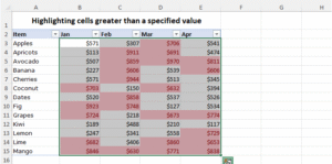
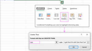
To highlight any cells with some values above certain numbers you need to follow these steps:-
- First you need to select the range of cells you want to format and you need to activate the quick analysis button.
- Under the formatting group you need to make a selection of greater than option.
- In the dialog box you need to type the number that you want to compare and you need to make a selection of the formatting style. The default option is light red and you need to fill it with dark red text.
- You need to click on the Ok button to confirm the process of your selection.
If you can follow these steps then you can easily highlight the cells that highlight the specified threshold.
Few related topics for your knowledge
- Mastering Advanced Data Validation In Excel: Essential Techniques To Learn
- Custom Number Formatting In Excel: Learn Amazing Tricks To Employ
- Top 25+ Shortcut Keys For Excel: Work Like A Pro
- How to Use Python in Excel – Tutorial and Tips
- Learn From The Best Advanced Excel Courses Online
- Flash Fill In Excel: What Is it & Step By Step Tutorial
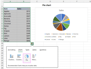
Creating Pie Chart Using Quick Analysis Tool In Excel
To generate a pie chart using the Quick Analysis Tool, follow these steps:
- Choose the data range for the chart, ensuring it includes both labels and values.
- Access the Quick Analysis button.
- Navigate to the Charts tab in the Quick Analysis menu, hover over the Pie chart option to preview it on your worksheet.
- Select the Pie chart option to add the chart to your sheet, or explore additional graph types by clicking More Charts.
Inserting Sparklines
There are some simple steps you need to take for inserting the sparklines using the quick analysis tool Excel. Some of the key factors to consider here in it are as follows:-
- You need to highlight the data range which you wish to see with sparklines.
- Click on the quick analysis button.
- Under all the spark lines tab select the preferred tab Lines, column, or win/ loss.
Quick Analysis Tool Excel Shortcut
The Quick Analysis tool in Microsoft Excel provides a convenient way to analyze data with various options like formatting, charts, totals, tables, and sparklines. Below are the primary shortcut keys to access and navigate the Quick Analysis tool, based on information from reliable sources:
1. For Access To Quick Analysis Tool Excel
Ctrl + Q (Windows) or Command + Q (Mac): After selecting a range of cells with data, press this shortcut to open the Quick Analysis tool menu. This works even if the Quick Analysis button doesn’t appear automatically. Note that on Mac, some sources indicate this shortcut may not always work due to system-level conflicts, so you may need to ensure Excel is active or check Mac keyboard settings.
2. For Navigating Quick Analysis Option
Once the Quick Analysis menu is open, you can use specific shortcuts to select categories within the tool. These shortcuts are pressed after Ctrl + Q (or Command + Q on Mac):
- Formatting: Ctrl + Q then F – Opens the Formatting options (e.g., Data Bars, Color Scales, Icon Sets, Greater Than, Top 10%).ablebits.com
- Charts: Ctrl + Q then C – Opens the Charts options to create recommended charts like clustered column or line charts.ablebits.com
- Totals: Ctrl + Q then O – Opens the Totals options for calculations like Sum, Average, Count, % Total, or Running Total.ablebits.com
- Tables: Ctrl + Q then T – Opens the Tables options to create a table or PivotTable.ablebits.com
- Sparklines: Ctrl + Q then S – Opens the Sparklines options to insert Line, Column, or Win/Loss sparklines.
3. Alternative Access
- Right-click Menu: After selecting a data range, right-click and choose “Quick Analysis” from the context menu to open the tool. On Mac, right-click by holding Control + Click. This is an alternative if the shortcut or button is unavailable.sizle.iomyexcelonline.com
- Arrow Keys: Once the Quick Analysis menu is open, use the Arrow Keys to navigate through the categories (Formatting, Charts, Totals, Tables, Sparklines) and options within each category. Press Enter to apply a selected option.
How To Access Quick Analysis Tools In Excel?
There are some of the simple steps that you need to follow for getting access to a quick analysis tool Excel. So, let’s go through the details to have a clear insight to it.
1. Select a Data Range:
- Highlight a range of cells containing data. The Quick Analysis tool works with non-empty cells and won’t activate for entire rows, columns, or blank cells.
2. Open The Quick Analysis Tool:
- Using the Shortcut: Press Ctrl + Q (Windows) or Command + Q (Mac) after selecting the data. This opens the Quick Analysis menu directly.
- Using the Button: After selecting the data, look for the Quick Analysis button (a small icon with a lightning bolt or a grid, depending on the Excel version) that appears at the bottom-right corner of the selected range. Click this button to open the menu.
- Using the Right-Click Menu: Right-click the selected data range and choose Quick Analysis from the context menu. On Mac, hold Control + Click to right-click.
3. Navigate The Quick Analysis Menu:
- Once open, the Quick Analysis menu displays tabs for Formatting, Charts, Totals, Tables, and Sparklines. Use the Arrow Keys to navigate between tabs and options, or click to select a category.
- You can also use shortcuts after opening the menu with Ctrl + Q:
- F for Formatting
- C for Charts
- O for Totals
- T for Tables
- S for Sparklines
- Press Enter to apply a selected option.
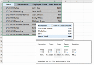
Quick Analysis Tool Pivot Table
To create a PivotTable using the Quick Analysis tool in Microsoft Excel, follow these steps:
1. Select Your Data Range:
- Highlight the range of cells containing your data. Ensure the data has headers (e.g., column titles like “Sales,” “Date,” etc.) for the PivotTable to work effectively. The Quick Analysis tool won’t activate if you select blank cells, entire rows, or columns.
2. Open the Quick Analysis Tool:
- Press Ctrl + Q (Windows) or Command + Q (Mac) to open the Quick Analysis menu. Alternatively, click the Quick Analysis button (a small icon with a lightning bolt or grid) that appears at the bottom-right corner of the selected range. You can also right-click the selected range and choose Quick Analysis (on Mac, hold Control + Click).
3. Navigate To The Tables Category:
- In the Quick Analysis menu, use the Arrow Keys or click to select the Tables tab. You can also press Ctrl + Q then T (Windows) or Command + Q then T (Mac) to jump directly to the Tables category.
4. Choose The PivotTable Option:
- In the Tables tab, you’ll see options like Table and PivotTable. Select PivotTable (often displayed as a grid icon or labeled as “Blank PivotTable”). Hovering over the option may show a preview of the PivotTable layout.
- Click the PivotTable option, or press Enter if navigating with the keyboard.
5. Configure The PivotTable:
- Excel will insert a new PivotTable in a new worksheet by default. The PivotTable Fields pane will show on the right, allowing you to build your PivotTable.
- Drag fields from your data (e.g., column headers) into the Rows, Columns, Values, or Filters areas to organize and summarize your data. For example:
- Place a field like “Category” in Rows to group data.
- Place a field like “Sales” in Values to calculate sums or counts.
- Excel may suggest a recommended PivotTable layout in the Quick Analysis menu. If you select a recommended PivotTable instead of the blank one, it will auto-configure based on your data.
6. Customize And Analyze:
- Adjust the PivotTable by adding or rearranging fields in the Fields pane.
- Use the PivotTable Tools on the ribbon (e.g., Analyze and Design tabs) to format, filter, or add features like slicers or calculated fields.
Final Takeaway
Hence, these are some of the crucial aspects of the quick analysis tool Excel that you need to be well aware of from your end. Additionally, this can make things work perfectly well in your favor.
You can share your views and comments in our comment box. This will help us to know your take on this matter. Additionally, this can boost the scope of your performances while you make use of this shortcut key.