.jpg)


Beginners Guide To Power BI Dashboard
Microsoft Power BI is a powerful business platform that converts raw data into interactive, visually appealing dashboards and reports. A Power BI dashboard is a single-page canvas that consolidates key metrics, KPIs, and insights from multiple reports into an at-a-glance view, enabling faster decision-making.
Dashboards feature tiles—live visuals like charts, gauges, cards, maps, and tables—that update in real-time as underlying data refreshes. Users pin the most important visuals from Power BI reports or create new ones directly using Quick Insights and natural-language Q&A.
With seamless integration to hundreds of data sources (Excel, SQL Server, Azure, web APIs, and more), Power BI supports scheduled refreshes, row-level security, and sharing via the Power BI service, mobile apps, or embedded solutions.
Ideal for executives, analysts, and teams, Power BI dashboards deliver actionable intelligence through stunning visuals, drill-down capabilities, and cross-filtering, turning complex datasets into clear, impactful stories that drive business success.
Table of Contents
- Background For Power BI Dashboard
- How To Create Power BI Dashboard
- Who Can Create A Power BI Dashboard?
- How To Publish Power BI Dashboard?
- Sample Power BI Dashboard
- What Makes A Great Power BI Dashboard?
- Power BI Sales Dashboard Example
- Power BI HR Dashboard Example
- Power BI Finance Dashboard Example
- Final Takeaway
Background For Power BI Dashboard
Microsoft Power BI was officially launched in 2015, evolving from earlier Excel add-ins like Power Query (2010), Power Pivot (2010), and Power View (2012). These tools addressed the growing need for self-service business intelligence, allowing business users—not just IT—to clean, model, and visualize data without heavy coding.
Before Power BI, organizations relied on slow, expensive tools like SAP BusinessObjects, IBM Cognos, or Tableau, which often required dedicated BI teams and long deployment cycles. Excel remained the dominant tool, but it struggled with large datasets, real-time collaboration, and interactive visuals.
Power BI changed this paradigm by combining:
- A free desktop application (Power BI Desktop)
- A cloud-based sharing and collaboration platform (Power BI Service)
- Mobile apps and embedded analytics
With its intuitive drag-and-drop interface, natural-language Q&A, AI-powered insights, and aggressive pricing (including a robust free tier), Power BI quickly gained traction.
By 2025, it consistently ranks as a leader in Gartner’s Magic Quadrant for Analytics and Business Intelligence Platforms, widely adopted across industries for creating dynamic, shareable dashboards that democratize data-driven decision-making.
Master MIS skills and boost your career potentialUnlock high-demand MIS job opportunities—Join our industry ready course today! |
|
| Classroom Course | Online Course |
| More Learning Options for you: Certificate in Data Science | Advanced Excel Course |
|
How To Create Power BI Dashboard?
There are several ways to create a Power BI dashboard that you must be well aware off while meeting your goals with complete ease:-
1. Get Power BI
- Download Power BI Desktop (free).
- Or use Power BI Service (web version).
- Sign in with a Microsoft account (work/school or personal).
2. Get Your Data
Common ways to import data:
- Excel/CSV files → Get Data → File
- SQL Server, Azure, SharePoint, Google Analytics, etc. → Get Data → Database or Online Services
- Web (scraping a table from a website) → Get Data → Web
- DirectQuery (live connection) or Import mode
Pro tip: Use Power Query Editor (click “Transform data”) to clean and shape your data (remove rows, change data types, merge tables, create calculated columns, etc.).
3. Build The Data Model
After loading data:
- Go to Model view
- Create relationships between tables (drag & drop fields, usually on common keys like CustomerID, Date, ProductID)
- Set correct cardinality (1-to-many is most common) and cross-filter direction
- Mark Date tables properly and create any needed calculated columns or measures using DAX
4. Create Report Pages
Switch to Report view:
- Drag fields from the right pane into the canvas to auto-create visuals
- Common visuals: Cards, Tables/Matrix, Bar/Column charts, Line charts, Maps, Slicers, KPIs
- Use Slicers for interactive filtering (e.g., Year, Region, Product)
- Add Drill-through pages for detailed views
- Format visuals (colors, titles, data labels, tooltips)
- Use Sync slicers across multiple pages
5. Publish To Power BI Service
- Click Publish in Power BI Desktop → choose workspace
- Or Save → Share if using the web version
6. Create The Actual Dashboard In Power Service
Important: In Power BI terminology:
- Report = detailed pages with many visuals
- Dashboard = a single canvas where you pin visuals from one or many reports
Steps:
- Go to https://app.powerbi.com
- Open your published report
- Hover over a visual → click the pin icon
- Choose or create a new Dashboard → Pin
- Repeat for other visuals (can come from different reports)
- On the dashboard, resize and arrange tiles
- Add extra tiles: text boxes, images, videos, web content, or live report pages
7. Make It Interactive & Beautiful
- Add dashboard-level filters
- Set up Q&A natural language
- Configure mobile view
- Add themes (JSON theme files) or company branding
- Set up row-level security (RLS) if needed
- Schedule automatic data refresh (in dataset settings)
8. Share The Dashboard
Options:
- Share link (with view or edit permissions)
- Embed in SharePoint, Teams, or public website
- Create an App workspace and publish as an App
- Export to PDF or PowerPoint (scheduled or manual)
Who Can Create A Power BI Dashboard?
Anyone can create a Power BI dashboard — no formal degree or certification is required. Here’s a clear breakdown of who typically creates them and what skills they usually have:
| Who Typically Creates Power BI Dashboards | Required Skills Level | Typical Background |
|---|---|---|
| Business Analysts | Intermediate to Advanced | Most common creators |
| Data Analysts | Intermediate to Advanced | Very common |
| BI Developers / BI Analysts | Advanced | Full-time BI roles |
| Finance/Accounting professionals | Beginner to Intermediate | FP&A, controllers, accountants |
| Marketing analysts | Beginner to Intermediate | Digital marketing, campaign analysts |
| Operations / Supply Chain analysts | Beginner to Intermediate | Logistics, inventory managers |
| HR analysts | Beginner to Intermediate | People analytics |
| Managers & Team Leads | Beginner | For quick self-service dashboards |
| IT / Data Engineers | Advanced | When building enterprise solutions |
| Consultants & Freelancers | Intermediate to Advanced | Client-facing dashboards |
| Students & Hobbyists | Beginner | Learning On personal projects |
Few related topics for your knowledge
- 40+ Important Interview Trial Balance Questions & Answers
- Top 30 MIS Analyst Interview Questions & Answers
- Don’t Miss These 40 G Suite Interview Questions to Land Your Dream Job
- 80 Most Common Power BI Interview Questions and Answers
- Career in Management Information System: Insights, Scope, Opportunities
How To Publish Power BI Dashboard?
There are some simple steps that you need to follow in order to publish Power BI Dashboard. Some of the key steps that you need to follow here are as follows:-
1. Finish Your Report In Power BI Desktop
- Create or open your report (.pbix file).
- Design all visuals, add filters, and test everything.
2. Save Your File
- File → Save (ensure it’s saved locally or on OneDrive/SharePoint for easier future updates).
3. Click Publish
- In Power BI Desktop, on the Home tab, click Publish → Publish to Power BI (or the big Publish button).
4. Sign In
- Log in with your work/school account (Microsoft 365 or Power BI-licensed account).
5. Choose Destination
- Select My workspace (for personal testing) or a specific App Workspace (recommended for sharing with teams).
- Click Select.
6. Wait For Success Message
- You’ll see “Publishing to Power BI… Success!” with a direct link.
7. Go To Power BI Service
- Open app.powerbi.com → navigate to the chosen workspace → you’ll now see your report.
8. Create The Actual Dashboard
- In the workspace, open your published report.
- Hover over any visual → click the pin icon → choose or create a new Dashboard → Pin.
- Repeat for all key visuals. The dashboard is now live!
9. Set Up Scheduled Refresh
- In the workspace → Datasets + dataflows → click the three dots next to your dataset → Settings → Gateway and connections (for on-prem data) or Data source credentials (for cloud sources) → configure and enable scheduled refresh.
10. Share The Dashboard
- Open the dashboard → click Share → add users/groups or generate a shareable link (with appropriate permissions: View, Edit, or Reshare).
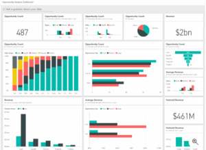
Sample Power BI Dashboard
Example of Sample Power BI Dashboard that you must be well aware off from your end are as follows:-
What Makes A Great Power BI Dashboard?
A great Power BI dashboard is a precision instrument. It is fast, honest, beautiful in its restraint, and—most importantly—actually used every day by the people who matter.
1. Laser Focused Purpose
A great dashboard answers exactly one high-stakes question: “Will we hit the revenue target?”, “Which stores are underperforming?”, “Is customer satisfaction improving?” The title itself gives the answer (“Q4 2025 Revenue: $184.3M – 97% of plan, on track”). Everything on the page exists only to prove or explain that single statement.
2. Sub -3 Second Load Time
Busy executives will abandon anything that makes them wait. Great dashboards open instantly on desktop and mobile. This is achieved through a clean star-schema model, Import mode with intelligent aggregations, minimal calculated columns, and ruthless removal of unused tables and measures.
3. Five To Seven Visuals Maximum
The human brain can process about six chunks of information at once. Great dashboards respect that limit. Typical winning combination: 3–4 big KPI cards at the top, one primary trend chart, one geographic or categorical breakdown, one “Top N” bar/column, and one supporting table/matrix with sparklines.
4. Strict Visual Hierarchy & Reading Flow
The eye must know where to go first, second, third. The most important number is physically the largest and positioned top-left (western reading gravity). Trend charts come next because movement over time is usually the core story. Breakdowns (region, product, channel) follow lower or to the right.
5. Generous White Space
Professional dashboards breathe. Crowded canvases feel amateur and stressful. Consistent 8-pixel gutters, aligned objects, and deliberate empty zones create calm and draw attention to what actually matters.
6. One Accent Color Grey
The entire dashboard uses one brand color for emphasis (target lines, positive variance, selected items) and shades of gray for everything else. Red and green are reserved exclusively for variance direction. The palette is always color-blind safe (tested with tools like Coblis or Power BI’s built-in checker).
7. Dynamic Self Updating Titles
Hard-coded titles are dead. Great dashboards use measures so the page title, section headers, and KPI cards automatically reflect the selected period: “Europe Sales – 2025 YTD (€42.1M, +19% vs LY)”.
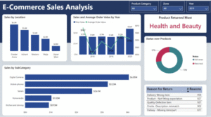
Power BI Sales Dashboard Example
1. E-commerce Sales Dashboard
An E-Commerce Sales Dashboard in Power BI is a dynamic, interactive visualization tool designed to transform raw online retail data into actionable insights. Unlike traditional reports, it provides a real-time, holistic view of your store’s performance—tracking everything from revenue streams and customer behaviors to inventory health and marketing ROI.
In 2025, with e-commerce sales projected to exceed $8 trillion globally, these dashboards are essential for managers, marketers, and executives to spot trends, optimize strategies, and drive decisions like pricing adjustments or targeted promotions.
Built on Microsoft’s Power BI platform, it integrates seamlessly with sources like Shopify, WooCommerce, Google Analytics, or Facebook Ads, enabling automated data refreshes and AI-powered anomaly detection.
2. Supermarket Sales Dashboard
This Power BI Supermarket Sales Dashboard Example is inspired by Microsoft’s Store Sales sample and the Kenyan Supermarket Sales dashboard from DataCamp, adapted for a mid-sized chain like “FreshMart Groceries” in 2025. It focuses on one core question: “Are we on track for $50M in FY2025 revenue across our 15 stores?”
As of November 25, 2025, YTD performance shows $38M (76% of target), with strong growth in perishables but margins squeezed by promotions. This single-page design uses the “4-Question Insight Test” (Is it good/bad? How much? Why? What to do?) for actionable insights.

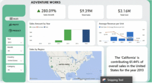
3. Sales Dashboard For Adventures Work
This Power BI Sales Dashboard Example is built on Microsoft’s official AdventureWorks dataset—a fictional global bike manufacturer specializing in cycling equipment and accessories. Inspired by community projects like the 2023 Edition from the Fabric Community and GitHub repositories such as richhuwtaylor/adventure-works and RohanParkar/AdventureWorks-Sales-Performance-Dashboard, it focuses on one core question: “Are we on track for $50M in FY2025 internet sales revenue?”
As of November 25, 2025, YTD performance shows $38M (76% of target), with strong growth in bikes but high returns in accessories. This single-page design adheres to 2025 best practices: 6 visuals max, <3s load time, mobile-optimized, and the “4-Question Insight Test” (Is it good/bad? How much? Why? What to do?). Download the free .pbix from Microsoft’s GitHub samples or the Fabric Community to customize.
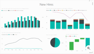
Power BI HR Dashboard Example
This Power BI HR Dashboard Example is inspired by Microsoft’s built-in Human Resources sample and Zebra BI’s HR Analytics template, tailored for a mid-sized tech company like “TechNova Solutions” in 2025.
It addresses one core question: “Is our workforce stable and diverse, with attrition below 10% for FY2025?” As of November 25, 2025, the dashboard shows 1,250 employees (YTD hires: 180, terminations: 85, attrition: 6.8%), with strong diversity gains but salary gaps in engineering.
This single-page design follows 2025 best practices: 6 visuals max, <3s load time, mobile-optimized, and the “4-Question Insight Test” (Is it good/bad? How much? Why? What to do?). Download the free .pbix from Microsoft’s Learn site or Zebra BI’s template to customize.
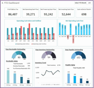
Power BI Finance Dashboard Example
Power BI Finance Dashboard can offer you clear insights about the latest financial position of your business. You need to develop a proper clarity in your mind while using this software. Some of the key factors to know here are as follows:-
1. Cash Flow Analysis Dashboard
A company generates cash inflows primarily from product sales, investment returns, and borrowed funds. Conversely, cash outflows represent the money leaving the organization to settle capital expenditures, repay debt, and meet various financial obligations.
Cash outflows refer to the funds a business disburses to cover capital investments, debt principal repayments, dividends, and other contractual commitments.
Incorporate the following key metrics into your cash flow dashboard:
- Cash Conversion Cycle (CCC): Measures the number of days required for a company to convert resource investments (inventory and other expenses) back into cash receipts from customers, highlighting the efficiency of working capital management.
- Runway: Indicates how many months (or years) the organization can continue operating at its current burn rate using existing cash reserves before requiring additional funding or revenue.
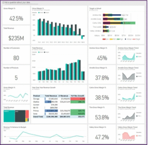
2. Profitability Dashboard
The dashboard gives you an instant, clear picture of the company’s current financial health, enabling you to quickly identify the true drivers of profitability, implement proactive pricing strategies, and systematically improve overall financial results.
Key profitability metrics you should include in your Power BI profitability dashboard:
- Gross Profit Margin: The percentage of revenue that remains after subtracting the direct cost of goods sold. It reveals how effectively the company manages production-related expenses.
- Net Profit Margin: The proportion of total revenue that remains as actual profit once all operating expenses, interest, taxes, and other deductions have been accounted for. It serves as the ultimate measure of overall profitability.
- EBITDA (Earnings Before Interest, Taxes, Depreciation, and Amortization): Represents core operating profitability by excluding non-cash expenses and financing/tax effects, offering a clean snapshot of the business’s underlying earning power.
- Gross Profit Percentage: Expresses gross profit as a percentage of total sales revenue, highlighting how efficiently the company converts sales into gross earnings.
- Operating Income (Operating Profit): Calculated by subtracting all operating expenses from gross profit; it reflects the true profit generated from day-to-day business activities before interest and taxes.
- Profit-to-Sales Ratio (Net Profit Margin): Measures how many cents of profit are generated for every dollar of revenue, providing direct insight into the effectiveness of pricing strategies and cost management practices.
3. Tax Compliance Dashboard
This dashboard promotes tax compliance by continuously tracking liabilities, deductions, and filing obligations, thereby minimizing compliance risks and enabling proactive, strategic tax planning.
Key Features:
- Tax Liability Tracking: Keeps real-time oversight of tax obligations across various tax types (such as income tax and VAT/sales tax) and geographic jurisdictions.
- Deductions and Credits Management: Monitors all qualifying deductions and available tax credits to maximize legitimate savings and reduce overall tax burden.
- Filing Status Monitoring: Delivers clear visibility into upcoming deadlines and the current status of all tax returns, ensuring submissions are completed accurately and on time.
Ultimately, the dashboard increases tax transparency, significantly lowers the risk of penalties, and empowers informed, forward-looking tax strategies.
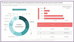
4. Operational Expenses
An Operational Expenses (OpEx) dashboard empowers you to tightly control costs and drive maximum operational efficiency by providing clear visibility into every major spending area, such as overhead, marketing spend, and personnel-related expenses.
Recommended metrics to include in your Power BI OpEx dashboard:
- Expense Ratios: Key indicators that express various costs as percentages of a reference figure (typically revenue), enabling you to quickly assess cost discipline and overall spending efficiency.
- Cost Per Unit: The average expense required to produce or deliver one unit of product or service; serves as a powerful gauge of production effectiveness and pricing competitiveness.
- Budget Deviations (Variance): Highlights the differences between actual expenditures and budgeted/planned amounts, instantly revealing overspending or underspending areas that require attention.
- FY vs PY Comparison: Year-over-year analysis that contrasts current fiscal year performance with the equivalent period from the previous year, making it easy to detect emerging trends, improvements, or deteriorations in cost behavior over time.
5. Sales Performance
Sales are the lifeblood of any business—they fuel growth and determine success. That’s why continuously monitoring sales performance is essential, and a well-designed sales performance dashboard becomes an indispensable tool for achieving this.
A sales performance dashboard delivers real-time visibility into your sales operations and effectiveness, allowing you to evaluate team performance, identify top-selling products, and refine sales strategies with precision.
Key metrics to feature in your sales performance dashboard:
- Monthly Sales: Total revenue generated from goods or services during a specific month.
- Sales by Region: Revenue earned across different geographic areas, revealing where customer demand is strongest or weakest.
- Product Sales: Income attributed to individual products or product lines, highlighting which items are most popular and profitable.
- Sales Growth Rate: The percentage increase (or decrease) in revenue compared to a previous period, showing the momentum and trajectory of your sales.
- Conversion Rate: The percentage of leads or website visitors who complete a desired action (typically a purchase), measuring the efficiency of your sales funnel.
- Customer Acquisition Cost (CAC): The total cost incurred to bring on a new customer, including marketing, sales efforts, and related operational expenses—critical for optimizing acquisition strategies and ensuring sustainable growth.

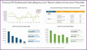
6. Accounts Payable & Receivable Dashboards
This dashboard delivers clear, real-time insight into unpaid invoices, incoming payments, and overall receivables, empowering you to strengthen cash flow control and make smarter working capital decisions.
Key Features:
- Accounts Payable Aging: Tracks how long vendor invoices have been outstanding, helping you maintain healthy supplier relationships while strategically timing payments.
- Accounts Receivable Aging: Monitors the age of customer invoices, enabling faster collections and reducing delays in converting sales into cash.
- Cash Conversion Cycle: Measures the number of days required to turn inventory purchases and customer receivables into available cash, giving you a powerful lever for liquidity optimization.
Ultimately, the dashboard supports proactive cash flow oversight, minimizes risks from delayed payments or uncollectible debts, and significantly improves the efficiency of working capital utilization.
Final Takeaway
Hence, these are some of the crucial facts about the Power BI Dashboard that you must be well aware of. Additionally, you cannot make your choices in the dark. Here, proper planning holds the key.
Here accurate planning holds the key. Try to develop a better solution from your counterpart. Ensure that you follow the correct process from your end points while meeting your needs with ease.


