.jpg)


Data Visualization in Excel: Creating Impactful Visuals
Today’s dealing with bundles of numbers can be a boring task. But don’t worry anymore. Now it’s too easy to deal with numbers in a more engaging way through spreadsheets. It tells your complete story through charts, bars, and graphs, and that’s called data visualization in Excel.
In this guide, you can learn how numbers can be presented through data visualization using Excel, which makes it more eye-catching and easy to understand. Make your business shine more in a spreadsheet with numbers for others through data visualization in Excel
Let’s dive into the step-by-step path for understanding all the different types of data visualization in Excel and its real-life applications.
Table of Contents
What Are Data Visualization In Excel?
Data visualization in Excel involves creating graphical representations of data to make it easier to understand, analyze, and communicate insights. Excel offers various tools and chart types to transform raw data into visual formats like charts, graphs, and dashboards. Here’s a concise overview:
Key Features Of Data Visualization In Excel
-
Charts And Graphs:
- Common Types: Bar, Column, Line, Pie, Area, Scatter, Doughnut, Radar, and more.
- Purpose: Visualize trends, comparisons, distributions, or relationships in data.
- Example: A column chart to compare sales across different regions or a line chart to show trends over time.
-
PivotCharts:
- Linked to PivotTables, these allow dynamic visualization of summarized data.
- Users can filter and slice data interactively to focus on specific insights.
-
Sparklines:
- Mini-charts placed within a cell to show trends or patterns in a compact form.
- Example: A sparkline showing monthly sales trends next to each product’s data.
-
Conditional Formatting:
- Visual cues like color scales, data bars, or icon sets to highlight patterns or outliers.
- Example: Color-coding cells to show high, medium, or low performance.
-
Dashboards:
- Combine multiple charts and tables on a single sheet to create an interactive overview.
- Use slicers and timelines for user-friendly filtering.
-
Other Tools:
- Power Query: Import and transform data for visualization.
- Power Pivot: Handle large datasets and create complex data models for advanced visuals.
3D Maps: Visualize geographic data on interactive maps (available in some Excel versions).
Understanding Data Visualization
The Power of Visuals
Data visualization in Excel not only transforms your numbers into fancy charts but also turns your confusing numbers into clear pictures that anyone can understand. With the bundles of available options like charts, graphs, colors, shapes, and more, change your data sheets into more attractive forms for easy analysis and better decisions. Let your data speak out louder and more clearly through data visualization using Excel
Importance in Business
Analyzing your business performance, and marketing metrics and understanding financial growth can be a difficult task previously. But now there are no more hasty tasks in spotting the errors or understanding your business growth; do all these by data visualization using Excel.
From an intern to a CEO, the data visualization tools help you understand the data on the go and improve the decision-making process. If a business wants to grow to its full potential, then it must use data visualization in Excel to make smart decisions and your business to succeed!
Excel as a Data Visualization Tool
Excel’s Graphical Capabilities
Data visualization using Excel provides businesses with multiple options, from charts to graphs, that businesses can use to represent data. Even so, you can use classic bar and pie charts to blend the data representation in a more engaging and appealing format of understanding.
PivotTables and PivotCharts
Introducing PivotTables, your data whisperer. It crunches numbers, spins them around, and lets you see things you never knew were there all on a tidy table. And the best part? It’s a dynamic duo with PivotCharts! Watch your visualizations dance and update in real-time as your data changes, keeping you ahead of the curve and in the know.
Now, we are going to explain the most important section of the article, which is the different types of data visualization in Excel. In addition to that, you can explore in which departments the business can implement this for easy analysis of data.

Types of Data Visualization in Excel
Data visualization in Excel offers businesses a variety of tools to turn complex data into meaningful insights. Let’s explore the various types of data visualizations that Excel provides, each serving specific needs and scenarios.
Column Charts
- Description: The first tool for data visualization using Excel is a column chart that represents data in vertical bars. It is usually used for comparing data across different categories.
- Use Cases: Sales Businesses can use column charts for comparing sales figures; they can even use them for tracking expenses. You can also use it for analyzing market share.
Let’s understand how column charts work in a real-life scenario.
Scenario
Let us consider that Satya Chemicals Pvt . Ltd. sells four different types of chemicals listed below as Product Category A, B, C, and D. The company operates in four different metro cities: Delhi, Mumbai, Bangalore, and Chennai, and sells all four product types there.
Recently, the sales department has presented quarterly sales numbers for all the products in all the operating cities. The sales data is presented below in the table
| City | Product Category A | Product Category B | Product Category C | Product Category D |
|---|---|---|---|---|
| Delhi | 5000 | 6000 | 4000 | 4500 |
| Mumbai | 4800 | 5500< | 4200 | 4300 |
| Bangalore | 5200 | 5800 | 3900 | 4700 |
| Chennai | 5100 | 5700 | 4100 | 4600 |
The manager while presenting data to management in a meeting, uses column charts to make it more clear for understanding. Check out the below representation of the column chart.
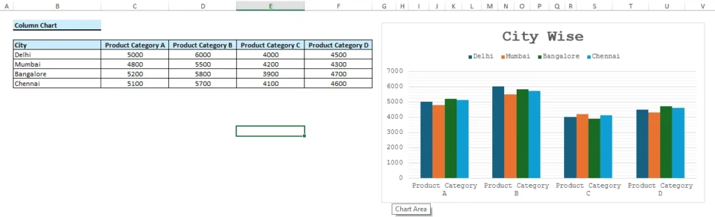
In just a few clicks, the manager created a column chart that presents a clearer view of sales figures. This representation helps to analyze which product types are performing better in their respective cities.
Bar Charts
- Description: The bar charts tool for data visualization in Excel represents the data in the form of horizontal bars. It is effective for long names or tight spaces
- Use Cases: Use it efficiently when you want to compare performance across different departments or are interested in showcasing survey data.
For a better understanding, let’s take a look at the given example of bar charts.
Scenario
A leading mobile dealer named Mobi World Pvt. Ltd. sells different brands of mobile phones, like Samsung Galaxy, iPhone, OnePlus, and Xiaomi Redmi. The company deals in the entire North, East, West, and South regions. The data on their number of mobile sales is mentioned below in the table:
| Region | Samsung Galaxy | iPhone | OnePlus | Xiaomi Redmi |
|---|---|---|---|---|
| North India | 2500 | 1800 | 1200 | 2800 |
| South India | 2200 | 1500 | 1300 | 3000 |
| East India | 1800 | 1200 | 1100 | 2400 |
| West India | 2000 | 1300 | 1000 | 2600 |
In an annual meeting, the management asked the sales department to show the complete number of sales of all the mobile phones in their respective region.
The head of the sales department already had the complete data, and, in a fraction of a section, he represented the data in bar graph format in Excel.
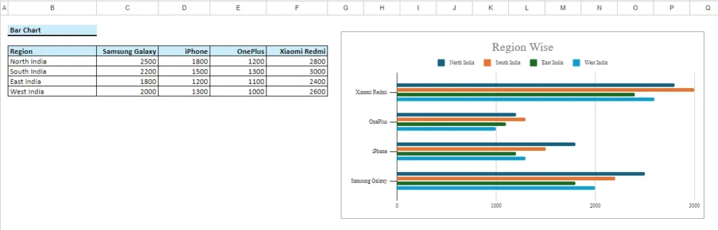
The above image shows the bar graph of the sales data mentioned in the table. The simple bar graph representation makes the data better for analysis.
Explore here some informative articles on Excel for improving your knowledge
Line Charts
- Description: In Excel, basically line charts are used to display trends over a continuous dataset. They connect data points with lines, emphasizing the overall pattern.
- Use Cases: Analyzing stock prices, tracking temperature variations, and showcasing project timelines.
Most of the time, while dealing with data comparison, people find it difficult to present and explain data accurately. To resolve this issue, we have explained the Line chart. To make it more clear for our readers, let’s explore the real-life case scenario.
Scenario
Mahesh owns a t-shirt manufacturing company and is doing good in his business. To better analyze the profit of the company, Mahesh asked the accounts department to share the data of the profit for the two consecutive years.
The accounts department, as per the instruction, shares the details of sales month-wise in an Excel sheet.
| Month | Last Year (in lakhs) | Current Year (in lakhs) |
|---|---|---|
| January | 20 | 9 |
| February | 40 | 48 |
| March | 50 | 56 |
| April | 30 | 61 |
| May | 70 | 25 |
| June | 50 | 32 |
| July | 90 | 43 |
| August | 110 | 116 |
| September | 125 | 136 |
| October | 132 | 116 |
| November | 137 | 141 |
| December | 141 | 163 |
Upon receiving the data from the accounts department in simple Excel format, Mahesh instructed the team to show it in some graphical format.
Let’s see how the accounts department presented the data in line graph format
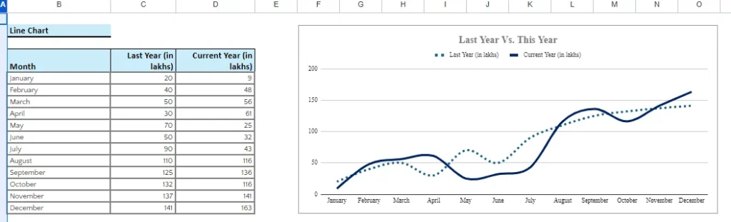
Now, you can analyze, how easy it is to understand the sales growth and decline in each month of the two consecutive years. This helps to make better-informed business decisions.
Pie Charts
- Description: Pie charts as a data visualization in Excel help to display data in the form of circular graphs. The graph is divided into slices to show the proportions of the whole.
- Use Cases: One can use pie charts to illustrate market share; even businesses can use them to show budget allocations. Sometimes it is also used to display survey results.
Scenario:
Let us understand the concept of a pie chart in Excel as a data visualization tool. An e-commerce website wants to analyze its sales performance in all the regions, like the north, south, east, and west.
The company owner asked the sales team to share the data on the sales performance of all the regions in percentage form. The team started preparing the data and listed it in the Excel sheet.
| Zone | Sales (in lakhs) |
|---|---|
| East | 5,146,885.15 |
| West | 1,778,014.87 |
| North | 1,590,855.41 |
| South | 842,217.57 |
| Total | 9,357,973.00 |
The above data represents the sales for each region and the total sales. The team smartly used the pie chart functionality of Excel and presented the data in percentage form.
This not only saves time in manual calculations but also represents the data in a more simple form for better understanding. The management can make better decisions by analyzing the data for those regions, where performance is not good.
Area Charts
- Description: Similar to line charts with an add-on feature of color. Yes, area charts represent lines with color that make the data even easier to understand and differentiate over time when it changes.
- Use Cases: Usually, area chart data visualization using Excel is implemented when businesses have to show cumulative totals, display stacked data, and visualize trends.
We already discussed the line chart in the above section. The area chart represents the same concept but with just one add-on feature of color in its graphical representation. Let’s dive into one more real-case scenario of an area chart as a data visualization tool.
Scenario
A laptop manufacturing company, Techno World Pvt. Ltd. wants to analyze its sales performance for the entire year. The accounts department received notification from management to prepare the sheet for the same.
After receiving instructions, the department started preparing the data and presented it wisely in the graphical format.
The following data is presented in the Excel sheet:
| Month | Current Year (in lakhs) |
|---|---|
| January | 9 |
| February | 48 |
| March | 56 |
| April | 61 |
| May | 25 |
| June | 32 |
| July | 43 |
| August | 116 |
| September | 136 |
| October | 116 |
| November | 141 |
| December | 163 |
Check the below graphical representation of the account team.
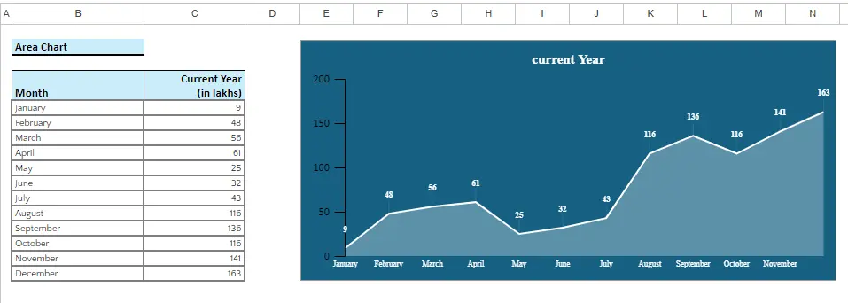
In the above image, you can see the colored graphical data presentation. This will help to analyze the sales figure far better than the simple line chart.
Scatter Plots
- Description: Scatter plots in the Excel data visualization tool use dots to display each data point. With the help of this data visualization tool, anyone can easily showcase the relationships between two variables.
- Use Cases: It makes the task easy for the sales and marketing departments. It means they can easily correlate how much sales are generated under a specific marketing budget. If you want to create a relationship between time spent studying and exam scores.
This tool is used for analyzing two different sets of data variables at a time. Let us explore scatter plots with a real-life example.
Scenario
There is one call center that solves the issue of one e-commerce platform user issues. The call center connects with the customers and resolves the payment issues, basically on that particular e-commerce platform.
Once the e-commerce company started auditing the data on the number of calls connected each day, the amount received meant sales were generated from those calls. The following data from the last 10 days was compiled in an Excel sheet for analysis:
| Sales Calls Made | Sales Revenue Generated |
|---|---|
| 10 | 500 |
| 20 | 1000 |
| 30 | 1500 |
| 40 | 2000 |
| 50 | 2500 |
| 60 | 3000 |
| 70 | 3500 |
| 80 | 4000 |
| 90 | 4500 |
| 100 | 5000 |
The company owner is not able to understand it clearly with the data presented in the Excel sheet. Owner instructed to show data in graphical format for better analysis. Let’s see the below graphical representation of the above data
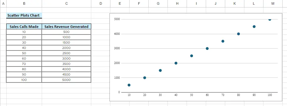
In the above image, you can see the call data is presented on the X-axis, and sales generated are presented on the Y-axis. Both variables are different and interrelated for some analytical purpose
These are just a few tools for data visualization using Excel that we have explained until now. Keep reading to understand the use of all Excel data visualization tools. You can also read some more Excel-related articles here for knowledge enhancement
Bubble Charts
- Description: Similar to scatter plots, but with an additional dimension represented by the size of the bubbles. It is useful for visualizing three sets of data.
- Use Cases: Displaying data with three variables, such as revenue, profit margin, and market share.
Radar Charts
- Description: Radar charts in Excel display data circularly, with each axis representing a different category. It is good to use it when you have multiple varieties of data.
- Use Cases: For example, you can use it when you want to compare performance data based on different set criteria or for evaluating employee skills.
Doughnut Charts
- Description: Doughnut charts are similar to pie charts but with a hole in the center. They provide a more concise way to display proportions.
- Use Cases: Visualizing budget distribution, and displaying contribution percentages.
Heat Maps
- Description: One more tool for data visualization using Excel is a heat map. It uses a variety of colors to represent the value of data in a matrix. The darker the color, the higher the value it indicates.
- Use Cases: It is used in displaying website traffic or showcasing employee performance scores.
Combo Charts
- Description: With the help of a combo chart, you can use different charts together, for example, a line chart with a bar chart.
- Use Cases: Businesses usually use this Excel data visualization to represent multiple data sets with different scales. It helps you to display data with both absolute and percentage values.
Gantt Charts
- Description: Gantt charts are another tool for data visualization using Excel. It displays project schedules by showing tasks and their durations along a timeline.
- Use Cases: Usually, it is used for project management, tracking task dependencies, and visualizing project timelines.
Waterfall Charts
- Description: This chart displays the cumulative effect of sequentially introduced positive or negative values.
- Use Cases: Measure sensitive financial data for accurate reporting with waterfall charts or use it to show inventory levels.
Read some Excel informative articles here
Treemap Charts
- Description: Now use treemap charts to display data in hierarchy order that is embedded in a rectangle structure. Each rectangle’s size and color show different dimensions.
- Use Cases: When a business wants to analyze data in hierarchical structures and showcase hierarchical relationships of data.
Box and Whisker Plots
- Description: Use data Box and whisker plots, or boxplots, to provide a visual summary of a dataset’s distribution, displaying its minimum, first quartile, median, third quartile, and maximum values.
- Use Cases: Analyzing statistical distributions, and comparing datasets.
I hope all the different tools for data visualization in Excel will help you showcase the reports in a more attractive format and convey your message, Whether you want to present financial data or analyze the trends or expenses. You can perform all the data visualization using Excel in a fraction of a second, with more clarity.
Let’s move on to the best practices that businesses can opt for data visualization using Excel.
Best Practices for Data Visualization in Excel
- Keep it Simple
Try to deliver your message simply by avoiding the many options available for optimizing your data through data visualization using Excel. Make sure that the correct information is passed on. - Consistency is Key
Ensure your data sets follow the same color, fonts, and styles across the complete data report. This consistency looks good and makes things easy to understand. - Use Colors Thoughtfully
If possible, then use the color that represents your data more clearly and concisely. For example, Bright yellow for profits, cool blue for losses – make it clear and avoid rainbows that hurt your eyes. - Provide Context and Labels
Before the final presentation, label your data with proper names that display its true value and meaning. Explain briefly what each piece of data shows to pass clear and correct information. - Test and Iterate
Visualize your data with others as well. It helps in fixing any issue if the data has one and, then you can fix it.
Till now, you have read the complete information on available tools for data visualization using Excel. If you are confused at any point or want to learn each concept of Excel in detail then visit the courses here
Now all these bars, graphs, and charts are used by businesses in different scenarios. Let’s read about the real-life application of data visualization tools
Real-Life Applications of Excel Data Visualization
-
- Sales Performance Dashboards
It’s so simple now to present your sales performance with the help of data visualization using Excel. Bar charts help show who’s crushing it, line graphs track trends, and gauges highlight targets. Analyze your performance easily and make smart decisions for better growth.
- Sales Performance Dashboards
-
- Financial Analysis and Reporting
The most difficult task of representing and analyzing financial data becomes easy with Excel data visualization. Excel works like a pro for your business. It showcases your income statements with colorful stories, your cash flow with line graphs, and much more. No more confusion in understanding the financial reports.
- Financial Analysis and Reporting
-
- Project Management Dashboards
Working as a project manager and struggling with managing project dashboards. No need to worry anymore, Gantt charts map your journey, and timelines keep you on track. With the help of task distributions, track who’s doing what. Managing projects just got smoother, faster, and way more visual!
- Project Management Dashboards
-
- HR Analytics
HR professionals mostly use Excel for most of their work. Whether they want to figure out the recruitment metrics or workforce diversity. Even employee performance or other reports. Everything can be presented nicely and clearly with the help of data visualization in Excel.
- HR Analytics
Conclusion
Become an Excel pro by learning these data visualization tools. It is the most valuable skill for improving your skills. By utilizing Excel data visualization, you can easily present your complex data structure to audiences in a clear and concise format. Excel empowers businesses to transform data into actionable insights.
By learning Excel data visualization techniques, professionals can elevate their analytical skills and can work promptly in the decision-making process